上一篇讲完 Flutter 中的一些基本部件,这篇就先填完上篇留下的没写的 AppBar 的坑,以及 Scaffold 其他参数的使用,在开始前,先补一张缩略版的脑图

1、AppBar
这一部分,我们只关注 Scaffold 中的 AppBar 剩下的还是埋坑【坑4】( ,居然已经埋了那么多坑了,坑虽多,代码还是要继续的),因为稍后会用到 StatefulWidget 的属性,所以就直接先使用了,和 StatelessWidget 区别用法可以这么记 需要数据更新的界面用 StatefulWidget,当然也不是绝对的,就是之前留的【坑1】所说的状态管理
1 | class HomePage extends StatefulWidget { |
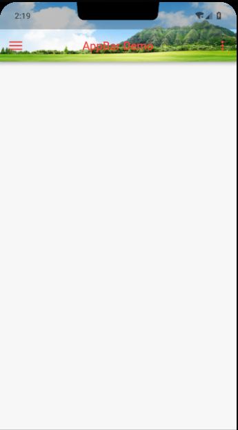
最后的效果图,未点击右侧按钮如左侧所示,点击右侧按钮会弹出相应的 mune
该部分代码查看 app_bar_main.dart 文件
看到效果图,相信很多小伙伴会吐槽,「**,上面那层半透明的啥玩意,那么丑」,接下来我们来解决这个问题,修改 void main 方法
1 | void main() { |
关闭后重新运行,就可以看到那层丑丑的「半透明蒙层」没有了
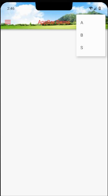
接着介绍下 PopupMenuButton 这个部件,还是按照惯例看构造函数
1 | // itemBuilder |
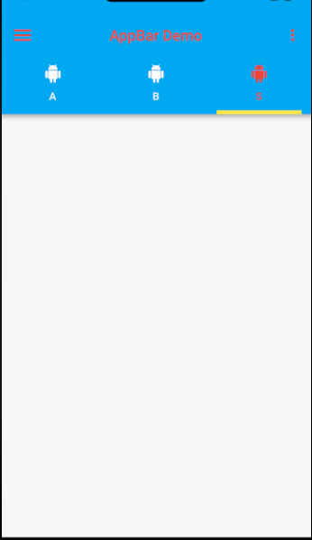
2、AppBar - bottom
AppBar 还有个 bottom 属性没讲,因为 bottom 这个属性和图片背景一起使用会比较丑,所以就单独拎出来讲,我们直接在原来的代码上修改
1 | // 这里需要用 with 引入 `SingleTickerProviderStateMixin` 这个类 |
最终的效果图如下
3、PageView + TabBar
那么如何通过 TabBar 切换界面呢,这边我们需要用到 PageView 这个部件,当然还有别的部件,例如 IndexStack 等,小伙伴可以自己尝试使用别的,这边通过 PageView 和 TabBar 进行关联,带动页面切换,PageViede 的属性参数相对比较简单,这边就不贴啦。最终的效果我们目前只展示一个文字即可,我们先定义一个通用的切换界面
1 | class TabChangePage extends StatelessWidget { |
定义通用界面后,就可以作为 PageView 的子界面传入并展示
1 | class HomePage extends StatefulWidget { |
最终的效果图就不贴了,可以发现滑动 PageView 或者点击切换 TabBar 的位置,界面显示的内容都会随之改变,同时,解决前面 Scaffold 留下 body 属性没讲的一个坑,就剩下 drawer 、 bottomNavigationBar 属性没讲了,在解决这两个坑之前,我们先处理下另一个问题
Scaffold 能够使我们快速去搭建一个界面,但是,并不是所有的界面都需要 AppBar 这个标题,那么我们就不会传入 appBar 的属性,我们注释 _HomePageState 中 Scaffold 的 appBar 传入值,把 body 传入的 PageView 修改成单个 TabChangePage ,然后把 TabChangePage 这个类做下修改,把 Container 的 aligment 属性也注释了,这样显示的内容就会显示在左上角
1 | // _HomePageState |
然后运行下,「**,文字怎么被状态栏给挡了…」
不要慌,静下心喝杯茶,眺望下远方,这里就需要用 SafeArea 来处理了,在 TabChangePage 的 Container 外层加一层 SafeArea
1 |
|
然后重新运行,一切正常,SafeArea 的用途可以看下源码的解释
1 | /// A widget that insets its child by sufficient padding to avoid intrusions by |
翻译过来大概就是「给子部件和系统点击无效区域留有足够空间,比如状态栏和系统导航栏」,SafeArea 可以很好解决刘海屏覆盖页面内容的问题,那么到目前为止,AppBar 的一些坑就说的差不多了,就要解决剩下的坑了

4、Scaffold - Drawer
drawer 同 endDrawer 属性是一样的,除了滑动的方向,Drawer 这个组件也相对比较简单,只要传入一个 child 即可,在展示之前,先对 appBar 做下处理,设置 leading 为系统默认,点击 leading 的时候 Drawer 就可以滑出来了,当然手动滑也可以
1 |
|
最终的效果图也不贴了,当手势从左侧滑出或者点击 leading 图标,抽屉就出来了
5、AppBar - bottomNavigationBar
bottomNavigarionBar 可以传入一个 BottomNavigationBar 实例,BottomNavigationBar 需要传入 BottomNavigationBarItem 列表作为 items ,但是这边为了实现一个 bottomNavigationBar 和 floatingActionButton 一个特殊的组合效果,我们不使用 BottomNavigationBar,换做 BottomAppBar,直接上代码吧
1 |
|
最终的效果图

既然提到了 StatefulWidget,顺带提下两种比较简单的部件,也算是基础部件吧。CheckBox、CheckboxListTile,Switch、SwitchListTile 因为比较简单,就直接上代码了,里面都有完整的注释
1 | class CheckSwitchDemoPage extends StatefulWidget { |
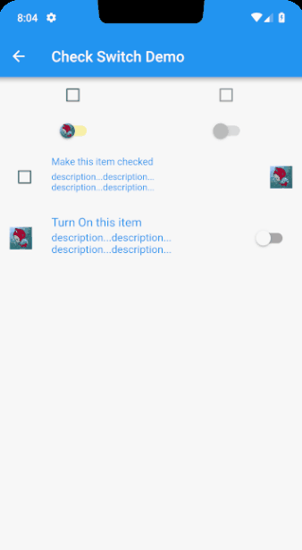
该部分代码查看 checkbox_swicth_main.dart 文件
终于这节把 Scaffold 留下的坑都填完了,然后又讲了两种基础部件,下节要填留下的别的坑了,目测还留了 2 个大坑,那就等以后继续解决吧~
最后代码的地址还是要的:
- 文章中涉及的代码:demos
- 基于郭神
cool weather接口的一个项目,实现BLoC模式,实现状态管理:flutter_weather - 一个课程(当时买了想看下代码规范的,代码更新会比较慢,虽然是跟着课上的一些写代码,但是还是做了自己的修改,很多地方看着不舒服,然后就改成自己的实现方式了):flutter_shop
作者:Kuky_xs
链接:https://www.jianshu.com/p/9119a1c1a123
来源:简书
简书著作权归作者所有,任何形式的转载都请联系作者获得授权并注明出处。